
Best practice is always changing. In this article I thought I’d take a brief look at how the front page of websites have evolved, the trends that have come and gone, and leave you with some food for thought on why I don’t like the current trend of static pages.
Pre-2010: The Text Era
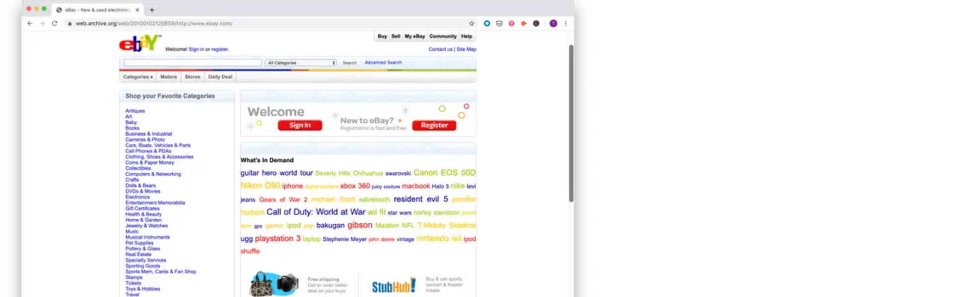
It seems crazy today, but there was a large contingent of people who thought that the internet was just a fad. BUT when you look at what websites were at the time, its hard to blame them. They took ages to load up, were largely text-based and horrible to look at. It’s also very easy to overlook that most people had to choose between being on the internet or being on the phone, and not every household was internet enabled. It was still something of a new concept to a large proportion of users. This is perhaps reflected in the design choices at the time. Home pages were extremely busy and had a lot of links in them. Their cluttered nature was probably done out of a fear that people might not be able to find what they were looking for unless each and every option was laid out.

2010: The Minimalist Era
Apple broke the mould and went with a ‘minimalist’ approach. They stripped back their menu. They included a lot of white space and they placed greater emphasis on product shots. I started designing websites about this time and let me tell you, it was pretty annoying how every other business wanted to copy what they were doing but didn’t necessarily understand that Apple’s success was not solely down to a nice website!
While Apple are often credited for their stripped-back approach to web design, I think the real innovation in what they did was the layering of information. On the outside they only had a few lines, but as you went further and further into a particular product…you got increasing amounts of information. This is a lesson that many designers forget today, and we tend to see businesses follow the minimalist route without backing it up with more info for those people not ready to fill out a form. We are already seeing the opposite trend happening with more and more information added to websites that was previously gated, as companies begin to see their websites as ‘always on’ pre-sales tools and not as pure lead generation. Many designers today are having to go back to what Apple did so successfully back in 2010.

2013: The Slider Era
As more businesses moved towards a ‘minimalist’ approach….many had a problem. They had all these lovely promotions and products they wanted to tell people about. How could they squeeze them all in without over-complicating the page? Sliders or Carousels were the answer, until they weren’t. Today most web designers will tell you that sliders are confusing for visitors, bad for SEO and are generally ignored. While this may be true, most of these anti-slider sentiments can actually be tied back to a single piece of research from Erik Runyon for the University of Notre Dame.
Erik found that only 1.07% of people clicked on the University’s sliders and of these people 89.1% clicked only the first slide. Quite often when this research was quoted it made out like this 1% rule applied to every slider on every website which was not the case. A more recent study by Kyle Peatt from Mobify which looked at several mid to large-sized eCommerce websites found that 72% of users swiped through sliders at least once. So maybe sliders aren’t so useless after all? While they may not suit every website it has been 9 years since that initial damning study and maybe it’s time to rethink if sliders are appropriate for you?
The real reason we begin to see a shift away from sliders was actually another advancement…mobile websites. In 2013, it was not uncommon for a brand to have a desktop website and then a completely separate app for mobile users. Businesses hoped that consumers would be willing to go onto the app store, download their app, which was essentially a more user-friendly version of their existing site. Not surprisingly, these soon died of death as soon as responsive design had matured.
2015: The Flat Era
As responsive design becomes the norm, we did have a few years where flat design (and often graphics) were big. To accommodate a growing number of mobile-only users, websites generally used more buttons and simpler design so that it was easier to navigate on smaller screens. In many ways this is almost a repeat of the initial minimalist era we saw Apple kickstart in 2010 with businesses having to choose which elements to highlight, reducing the amount of text on their website and also using video to a far greater extent. We see the adoption of cleaner graphic styles in this time period, with icons becoming very popular. Today many elements of flat design are still in play, but its now so easy to get good quality photos and graphics and incorporate them into our web design, that the flat design of the past looks less ‘designed’ and more ‘lazy’.
2017 – Today: The Static Era
With the slow death of sliders on most website, a different trend begins to emerge. We see companies looking to use their front page to tell a story and sum up who they are as a business. Now with timed elements and effects, they could sweep you down the page in beautiful new ways and sum up who they are as a business. I personally have always hated this approach to a home page because while the experience can be interesting and informative….the first time, after you’ve looked at it once, you never have a reason to again. It doesn’t give the user a reason to come back. It doesn’t highlight anything new. And all too often companies use this approach to link off to every section of their website, making the page incredibly long and not necessarily cohesive. Static home page design doesn’t reflect what most people spend their time online doing. Searching feeds for content. Searching through websites for products. Even in B2B people are more likely to look at your client list, case studies and about you then they are to scroll through a page detailing your vision. For me, this approach completely ignored repeat visitors and just doesn’t work.
The Future?
When looking at the above trends, what’s interesting is how many of these were brought about by challenges with the technology at the time, and how many of the principals may come back in one form or another. So what about the homepage of the future?
In my recent article I talked about how the role of websites is changing and how channel marketing may become as important as looking after ones own website. For me the principals of a good home page are quite simple:
- Tells the visitors what you do in a quick and obvious way.
- Highlights what’s new and interesting to repeat visitors.
- Direct people to relevant page/products etc.
- Has a strong call to action.
It sounds simple on paper, but is undoubtedly the hardest page of any website to get right!
