
With your name locked down one of the trickier aspects of any company is the logo. There is something of an art to a good logo. It should be instantly recognisable, convey something of what you do (where possible) and work on a variety of different media. Here are some hard on fast rules on what makes a good logo….
Illustration
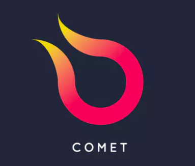
![]() Although a logo can be some form of Icon what it should never be is a full illustration or picture. Not only will this take up an awful lot of space, almost always rely on multiple colours, but should be completely unnecessary. Any logo wants to be simple and easy to draw.
Although a logo can be some form of Icon what it should never be is a full illustration or picture. Not only will this take up an awful lot of space, almost always rely on multiple colours, but should be completely unnecessary. Any logo wants to be simple and easy to draw.
Colour Selection
When designing any logo it’s important that it works in ANY colour and I would always recommending designing it in black and white to begin with. Your logo shouldn’t be reliant on a subtle colour change or gradient, no matter how nice it might look! Any logo should work in simple black and white.

What You Do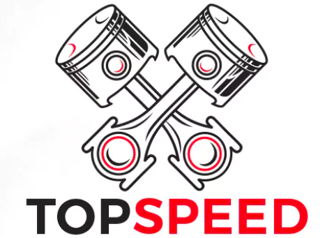
One of the hardest aspects with any logo is incorporating what your business actually does in a simple and easily relatable form. I would try and stay away from icons/images that the general public can’t easily grasp. As an example if you were a car mechanic then a symbol of a car is more fitting then these piston heads.
Simple Lines
A good test of any logo design is to show your proposed logo to someone, and then a few hours later give them a pen and pencil and see if they can draw it. it should be that simple. Using my past awful logo as an example. You can see our original logo was far too complex (this only lasted 3 months) and was refined into the much simpler one on the right. This logo can be replicated with 3 strokes and still clearly represents a ‘M’.

Type Face
Using a specific font is a popular way of creating a logo. Don’t forget that people don’t own the rights to their fonts. Have noticed an odd trend where people now understand that images are subject to copyright but don’t consider fonts and icons do for some reason. The main issue with a specific font is appropriation. Let’s say you are borrowing a friends laptop that doesn’t have that font…you’ll have to download the image and import it etc which might be fine for you but not your 70 year old accountant.
Represents You
Last but certainly not least, your logo should represent your outlook as a business and the sector you are serving. Not every business needs a beautiful logo if they are serving a serious sector.