Having talked about what exactly a brand is and how it reflects your business, we are looking at the core elements that make up that brand, and this week fonts. I don’t know what the correct word is for someone who loves fonts (fontophile sounds wrong) but I subscribe to two different font newsletters…so am probably your best guide.
Subtle Signs
Fonts are certainly one of the less noticeable ways in which brand distinguish themselves, certainly outside of a logo many of us may struggle to know exactly which font is being used on the main bit of text on any given website. Yet despite this, they can have a big impact on your perception. A picture they say, is worth a thousands words, well a font talks to your customer before they’ve even read your text. Fonts come in families and for those of you less initiated here is a quick overview:
Serif Fonts
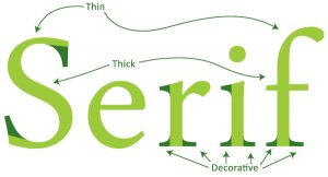
A“Serif”is a small decorative line at the end of a characters (letter) stroke. The most famous example of this is Times New Roman which has long been the pre-selected font on most Microsoft applications.
I am told that the reason for these is that it is the easiest font for dyslexic people to read, but am not sure if that is still the case. In fact back when screen resolution was considerably lower, many struggled to add these small delicate Serifs, although this is hardly an issue today. Interesting fact about serif fonts is that they are the oldest kind of font and originate from carved inscriptions from the Roman Imperial Period, and CAPITAL letters in serif fonts have remained much the same as from that time. Due to this long history, serif fonts are generally considered to be the best where you have a long passage of text say in a book.
Sans Serif Fonts
If anyone reading did a bit of high school French (or just is in France) then you might be able to figure out that Sans means without and so Sans Serif fonts are fonts without the little decorative lines at the end. As above, as screen based technology took off so too did sans serif fonts. They are bolder and more modern than their serif counterparts.
Script Fonts
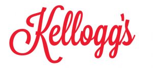
Script fonts look essentially like cursive, so handwriting and they have skyrocketed in popularity. There are a vast variety of different fonts but speaking in broad terms whenever you want something to look home made or artisan this might be an option. I would only limit your use of Script to headlines and font as the main bulk of text may be difficult to read if its all like this. Oh and no Script font discussion is complete without mentioning the internet’s most infamous font: Comic Sons. I once had a cient insist on using this in a pitch document to a huge multi-national company. I showed him all the memes..but alas he could not be swayed.
Fonts are a small cog in your branding machine, but a vital one. For some reason people don’t realise that fonts are also subject to copyright, so make sure you have all the licenses you need, if in doubt use google fonts.


