The next major piece of our branding jigsaw are graphic elements. Basically anything could be a graphical element in your brand. A squiggle could be a graphic element, a certain type of Box could be a graphic element, anything at all so long as you use them often enough. Let’s take a few examples and elaborate further.
Definition
For the purposes of what we are talking about here, when I talk about graphic elements I am not referring to any sort of illustration, photos or other content. This is more the elements that play a functional or decorative role in your branding, most often simple icons, patterns, shapes and similar.
What Does That Mean?
When examined in a vacuum, it is sometimes difficult to understand the reasons behind any given branding element, and one particularly good example of this is Macmillian. Now for those of you who don’t know, Macmillian are a UK based Charity focusing on the provision of nurses and support services for cancer patients and their families. Now given this you might be inclined to picture their brand as soft colours, lots of round shapes, maybe some delicate patterns. Yet instead we get almost the opposite, Macmillian uses dark greens and the heavy use of rough paint brush effects in its background.
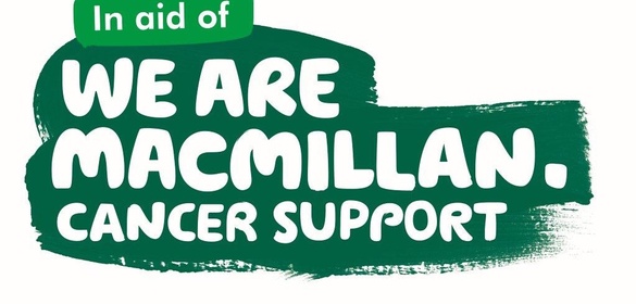
The effect of this is a very bold and striking brand, very heavy on text with an almost “hand written” font. When the charity rebranded in 2006, it felt that cancer was a word that made people uncomfortable and was often said behind closed doors. This new branding plastered Cancer in huge fonts all over buses and billboards and created a strong association with the brand. Looking at the paint brushes and the font, Macmillan’s brand feels much more like a grass roots movement.
Now, objectively you could say that the green and purple paint squiggles are not particularly friendly, and I recall that originally there was a lot of backlash against the rebrand, but the more they used it the more popular it became. It is not always easy to justify WHY something works, sometimes it just looks good.
Internal Logic
Although justification on any given branding element is often difficult, there does need to be some sort of internal logic to how the elements of your brand fit and why they are there. We come back again to that little exercise from earlier on defining a brand. What 3 core attributes do you want your brand to convey and how can you go about it?
Let’s say you were running a cinema, your branding elements might be the use of banners behind your text, quite possibly in a gold or red. Any sort of banner has an association with a special event or announcement, and these days going to the cinema is a special treat. The gold. yellow colour is often used for its positive associations and to convey a sense of luxury albeit not on the scale that a silver or grey might. It conveys a more premium experience than being sat at home.
Reusability
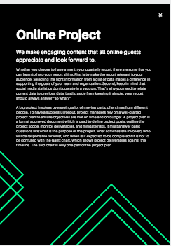
Consistency within any brand is important and hopefully once you’ve found an element that works, you can use it in multiple different ways. A little example here of a 3 line square shape which when placed around various edges can be used as arrows, frames or decoration all while maintaining your brand. A good element should stick around for years.